Add Custom Forms
Last updated 3/08/2023
Before you add a Custom Form you will need to refer to the following chapters:- Project Setup, to know how to set up your development environment.
- Writing a Plugin, to know how to download Five's templates.
As mentioned in the Front-End Plugin Types chapter there are two ways a custom form can be displayed; to take the entire screen or to take the place of a regular form. Both methods will be covered in this documentation.
There are four steps to creating a custom form:- Write your code using Five's custom-form-template.
- Run the final Webpack build command.
- Create a Custom Action.
- Either create a menu item for the custom action, or create an action button to call the custom action.
info
There is a full guide on how to create cards using the custom-form-template that you can find in our Learning Resources chapter.
tip
You are not restricted to what can be coded in our custom-form-template!
Add Your Code
1. Open your preferred IDE.2. Open the custom-form-template-folder.
3. Open the Src folder.
info
The customForm.tsx file is the template you will use to write the code for your custom form.
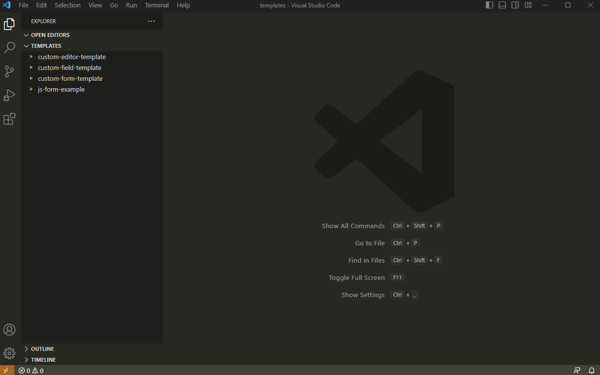
Figure 1 - customForm.tsx file
info
The entire template can be edited to suit your code requirements. The example code that is used for this demonstration is provided below.
note
If you are want to use the code provided follow the steps below.
4. Delete the current code in the template.
5. Click the Copy button on the code block provided below.
6. Paste and save the code in your IDE.

customForm.tsx
import React, { useState } from 'react';

import { CustomFormProps } from '../../../common';

import {
    FiveInitialize,
    Box,
    FormControl,
    IconButton,
    InputAdornment,
    TextField,
    Paper,
    ThemeProvider,
    Toolbar
} from './FivePluginApi';

FiveInitialize();

// Material ui icons for visibility and invisibilty
const Visibility = <svg xmlns="http://www.w3.org/2000/svg" height="24px" viewBox="0 0 24 24" width="24px" fill="#000000"><path d="M0 0h24v24H0V0z" fill="none"/><path d="M12 6c3.79 0 7.17 2.13 8.82 5.5C19.17 14.87 15.79 17 12 17s-7.17-2.13-8.82-5.5C4.83 8.13 8.21 6 12 6m0-2C7 4 2.73 7.11 1 11.5 2.73 15.89 7 19 12 19s9.27-3.11 11-7.5C21.27 7.11 17 4 12 4zm0 5c1.38 0 2.5 1.12 2.5 2.5S13.38 14 12 14s-2.5-1.12-2.5-2.5S10.62 9 12 9m0-2c-2.48 0-4.5 2.02-4.5 4.5S9.52 16 12 16s4.5-2.02 4.5-4.5S14.48 7 12 7z"/></svg>
const InVisibility = <svg xmlns="http://www.w3.org/2000/svg" height="24px" viewBox="0 0 24 24" width="24px" fill="#000000"><path d="M0 0h24v24H0V0zm0 0h24v24H0V0zm0 0h24v24H0V0zm0 0h24v24H0V0z" fill="none"/><path d="M12 6c3.79 0 7.17 2.13 8.82 5.5-.59 1.22-1.42 2.27-2.41 3.12l1.41 1.41c1.39-1.23 2.49-2.77 3.18-4.53C21.27 7.11 17 4 12 4c-1.27 0-2.49.2-3.64.57l1.65 1.65C10.66 6.09 11.32 6 12 6zm-1.07 1.14L13 9.21c.57.25 1.03.71 1.28 1.28l2.07 2.07c.08-.34.14-.7.14-1.07C16.5 9.01 14.48 7 12 7c-.37 0-.72.05-1.07.14zM2.01 3.87l2.68 2.68C3.06 7.83 1.77 9.53 1 11.5 2.73 15.89 7 19 12 19c1.52 0 2.98-.29 4.32-.82l3.42 3.42 1.41-1.41L3.42 2.45 2.01 3.87zm7.5 7.5l2.61 2.61c-.04.01-.08.02-.12.02-1.38 0-2.5-1.12-2.5-2.5 0-.05.01-.08.01-.13zm-3.4-3.4l1.75 1.75c-.23.55-.36 1.15-.36 1.78 0 2.48 2.02 4.5 4.5 4.5.63 0 1.23-.13 1.77-.36l.98.98c-.88.24-1.8.38-2.75.38-3.79 0-7.17-2.13-8.82-5.5.7-1.43 1.72-2.61 2.93-3.53z"/></svg>;

const CustomForm = (props: CustomFormProps) => {
    const { theme } = props;
    const [ height, setHeight ] = useState<number>(200);
    const [ showPassword, setShowPassword ] = useState<boolean>(false);

    // ensure the paper fills the space it is given in the display
    const onPaperDisplayed = (node: any) => {
        if (!node) {
            return;
        }

        const rect = node.getBoundingClientRect();
        const newHeight = window.innerHeight - rect.top - 48;
        if (height != newHeight) {
            setHeight(newHeight);
        }
    }

    // turn on and off this visibility of the password fields
    const handleClickShowPassword = () => {
        setShowPassword(!showPassword);
    }

    return <ThemeProvider theme={theme}>
        <div style={{height: height}}>
        <Paper style={{ height: 'inherit' }} ref={(node) => onPaperDisplayed(node)}>
            <Toolbar>Example of TextField Options</Toolbar>
            <Box sx={{ display: 'flex', flexWrap: 'wrap' }}>
            <div>
                <TextField
                label="With normal TextField"
                variant='outlined'
                id="outlined-start-adornment"
                sx={{ m: 1, width: '25ch' }}
                InputProps={{
                    startAdornment: <InputAdornment position="start">kg</InputAdornment>,
                }}
                />
                <FormControl sx={{ m: 1, width: '25ch' }} variant="outlined">
                <TextField
                    id="outlined-adornment-weight"
                    variant='outlined'
                    aria-describedby="outlined-weight-helper-text"
                    helperText='Weight'
                    inputProps={{
                        'aria-label': 'weight',
                    }}
                    InputProps={{
                        endAdornment: <InputAdornment position="end">kg</InputAdornment>
                    }}
                />
                </FormControl>
                <FormControl sx={{ m: 1, width: '25ch' }} variant="outlined">
                <TextField
                    id="outlined-adornment-password"
                    variant='outlined'
                    placeholder='Password'
                    type={showPassword ? 'text' : 'password'}
                    InputLabelProps={{
                        shrink: true
                    }}
                    InputProps={{
                        endAdornment: <InputAdornment position="end"><IconButton
                        aria-label="toggle password visibility"
                        onClick={handleClickShowPassword}
                        edge="end"
                        >
                        {showPassword ? Visibility : InVisibility}
                        </IconButton></InputAdornment>
                    }}
                    label="Password"
                />
                </FormControl>
                <FormControl fullWidth sx={{ m: 1 }}>
                <TextField
                    id="outlined-adornment-amount"
                    variant='outlined'
                    InputProps={{
                        startAdornment: <InputAdornment position="start">$</InputAdornment>
                    }}
                    label="Amount"
                />
                </FormControl>
            </div>
            <div>
                <TextField
                label="With normal TextField"
                variant='filled'
                id="filled-start-adornment"
                sx={{ m: 1, width: '25ch' }}
                InputProps={{
                    startAdornment: <InputAdornment position="start">kg</InputAdornment>,
                }}
                />
                <FormControl sx={{ m: 1, width: '25ch' }} variant="filled">
                <TextField
                    id="filled-adornment-weight"
                    variant='filled'
                    aria-describedby="filled-weight-helper-text"
                    helperText='Weight'
                    inputProps={{
                        'aria-label': 'weight',
                    }}
                    InputProps={{
                        endAdornment: <InputAdornment position="end">kg</InputAdornment>
                    }}
                />
                </FormControl>
                <FormControl sx={{ m: 1, width: '25ch' }} variant="filled">
                <TextField
                    id="filled-adornment-password"
                    variant='filled'
                    placeholder='Password'
                    type={showPassword ? 'text' : 'password'}
                    InputLabelProps={{
                        shrink: true
                    }}
                    InputProps={{
                        endAdornment: <InputAdornment position="end"><IconButton
                        aria-label="toggle password visibility"
                        onClick={handleClickShowPassword}
                        edge="end"
                        >
                        {showPassword ? Visibility : InVisibility}
                        </IconButton></InputAdornment>
                    }}
                    label="Password"
                />
                </FormControl>
                <FormControl fullWidth sx={{ m: 1 }}>
                <TextField
                    id="filled-adornment-amount"
                    variant='filled'
                    InputProps={{
                        startAdornment: <InputAdornment position="start">$</InputAdornment>
                    }}
                    label="Amount"
                />
                </FormControl>
            </div>
            <div>
                <TextField
                label="With normal TextField"
                variant='standard'
                id="standard-start-adornment"
                sx={{ m: 1, width: '25ch' }}
                InputProps={{
                    startAdornment: <InputAdornment position="start">kg</InputAdornment>,
                }}
                />
                <TextField
                    label="Weight"
                    variant='standard'
                    id="standard-start-adornment"
                    sx={{ m: 1, width: '25ch' }}
                    InputProps={{
                        endAdornment: <InputAdornment position="end">kg</InputAdornment>,
                    }}
                />

                <FormControl sx={{ m: 1, width: '25ch' }} variant="standard">
                <TextField
                    id="standard-adornment-password"
                    variant='standard'
                    placeholder='Password'
                    type={showPassword ? 'text' : 'password'}
                    InputLabelProps={{
                        shrink: true
                    }}
                    InputProps={{
                        endAdornment: <InputAdornment position="end"><IconButton
                        aria-label="toggle password visibility"
                        onClick={handleClickShowPassword}
                        edge="end"
                        >
                        {showPassword ? Visibility : InVisibility}
                        </IconButton></InputAdornment>
                    }}
                    label="Password"
                />
                </FormControl>
                <FormControl fullWidth sx={{ m: 1 }}>
                <TextField
                    id="standard-adornment-amount"
                    variant='standard'
                    InputProps={{
                        startAdornment: <InputAdornment position="start">$</InputAdornment>
                    }}
                    label="Amount"
                />
                </FormControl>
            </div>
            </Box>
        </Paper>
        </div>
    </ThemeProvider>
}

export default CustomForm;
tip
For a full list of supported components, click here.
Run Your Final Webpack Build Command
1. Open a new terminal.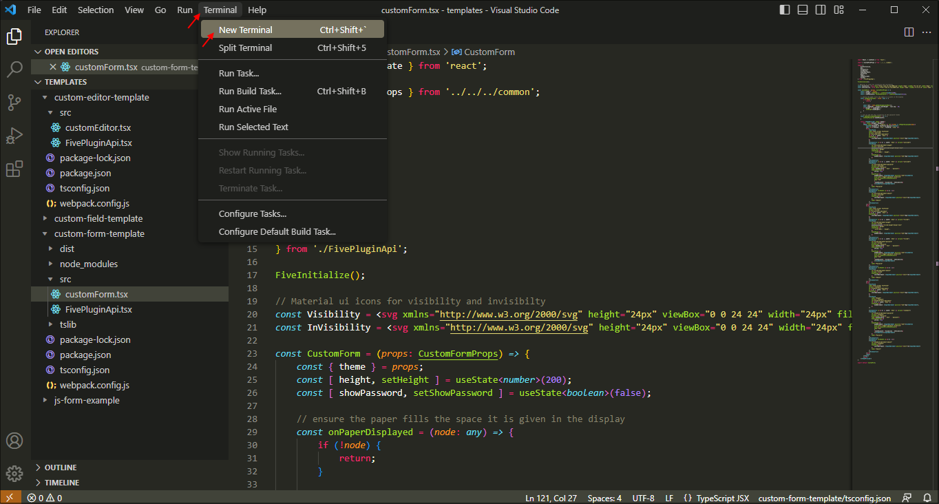
Figure 2 - Open a new terminal
2. Cd into the custom-form-template and run the Webpack command to build your final build.
node ./node_modules/webpack/bin/webpack.js
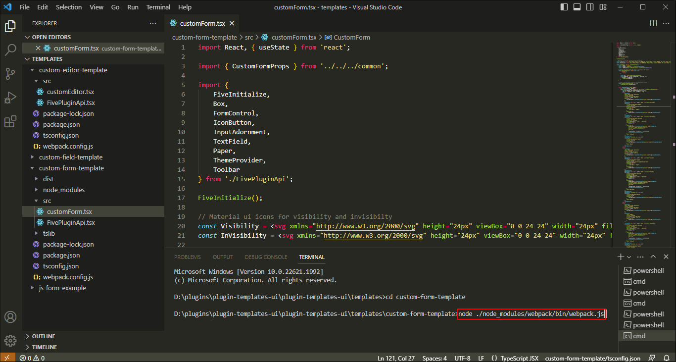
Figure 3 - Run the Webpack command
3. Locate and open your dist folder.
4. Inside the dist folder compress your .js plugin file to a zip file.
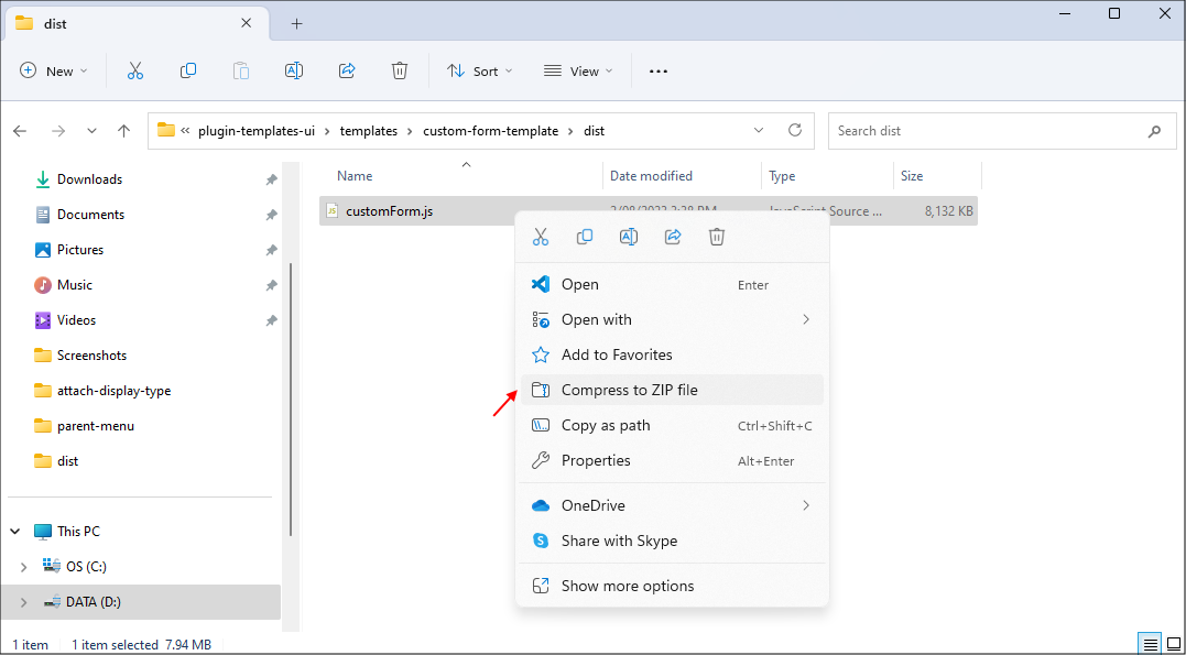
Figure 4 - Compress your .js plugin file to a zip file
tip
Rename your zip file to a more relevant name!
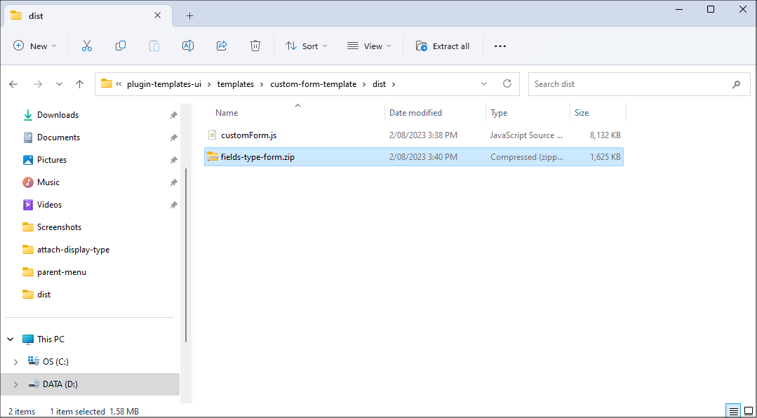
Figure 5 - Rename your zip file
Prerequisites
After running your final Webpack build command and compressing your .js plugin file, you will need to return to Five and create a custom action.For the FieldsType custom form example, an application was created with one table called FieldsType that has one field called Name.
FieldsType Table
| Field | Data Type | Size |
|---|---|---|
| Name | Text | 255 |
A form was created called Fields Types that has one field called Name. The Fields Types form was created by the Form Wizard to automatically create a menu item for the form.
Fields Types Form
| Field |
|---|
| Name |
Navigate to Custom Actions
1. Click Visual in the menu.2. Click Custom Actions in the sub-menu.
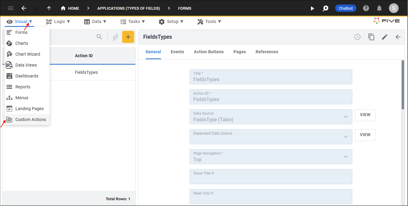
Figure 6 - Custom Actions menu item
Add a Custom Action
1. Click the Add Item button.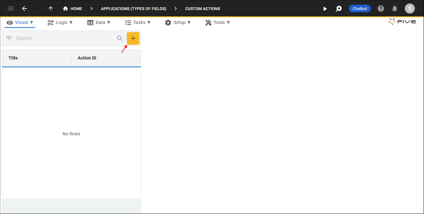
Figure 7 - Add Item button
2. Type a title in the Title field.
3. Click the UPLOAD PLUGIN button in the Upload Plugin field.
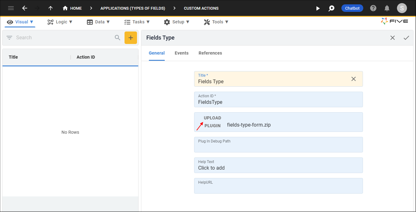
Figure 8 - Add a Custom Action
4. Navigate your files and open the zip folder.
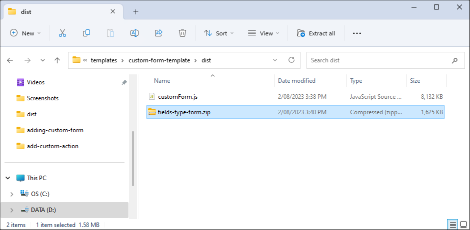
Figure 9 - Zip file
5. Click the Save button in the form app bar.
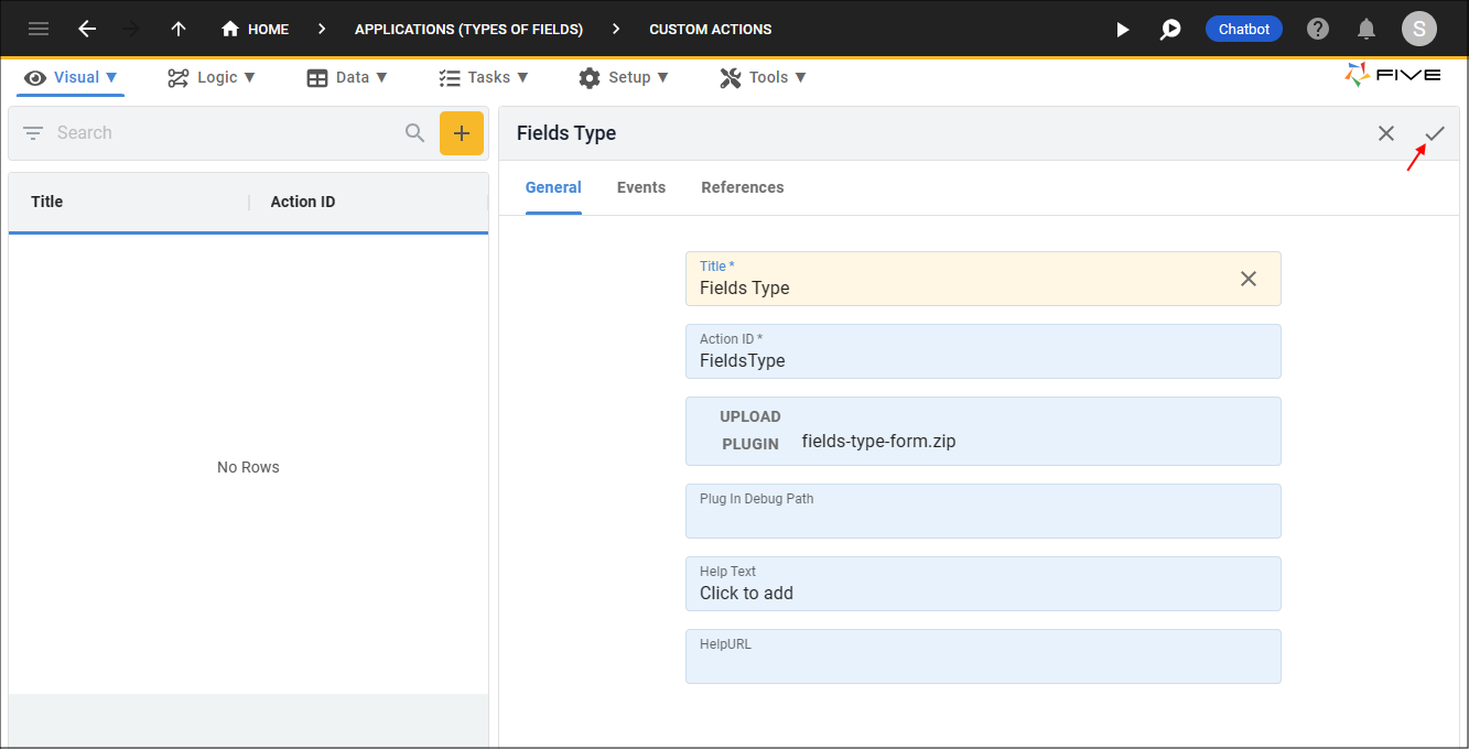
Figure 10 - Save the Custom Action record
Create a Menu Item for Your Custom Action
info
By creating a menu item for your custom action, the custom action will take the entire screen.
1. Click Visual in the menu.
2. Click Menus in the sub-menu.
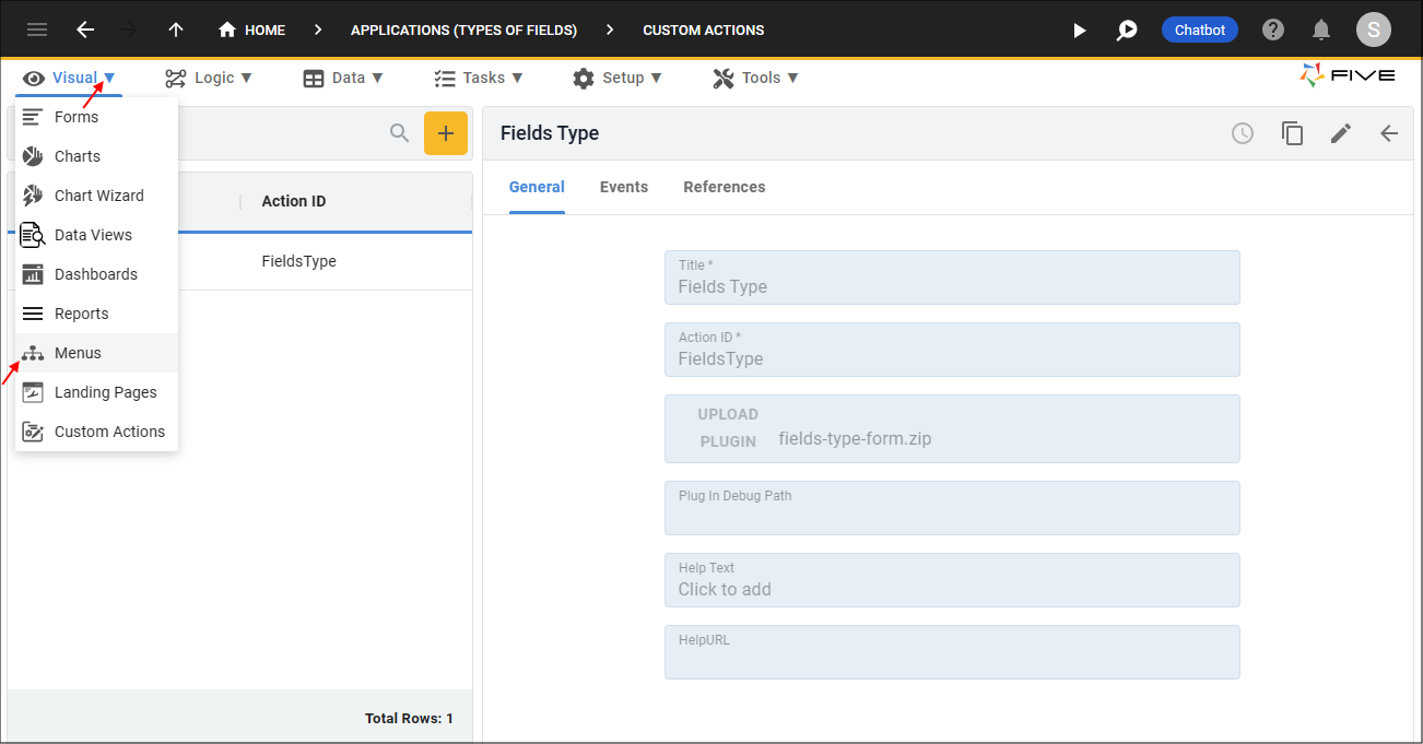
Figure 11 - Menus menu item
3. Click the Add Item button.
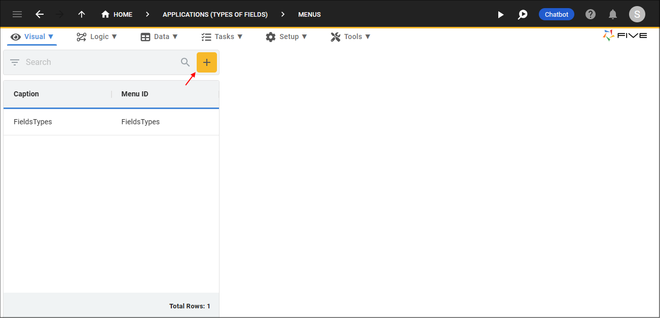
Figure 12 - Add Item button
4. Type a caption in the Caption field.
5. Type a number in the Menu Order field.
6. Click the lookup icon in the Action field and select the custom action.
7. Optional: Click the Edit button in the Icon field and open an image file.
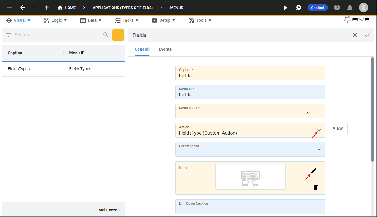
Figure 13 - Add a Menu
8. Click the Save button in the form app bar.
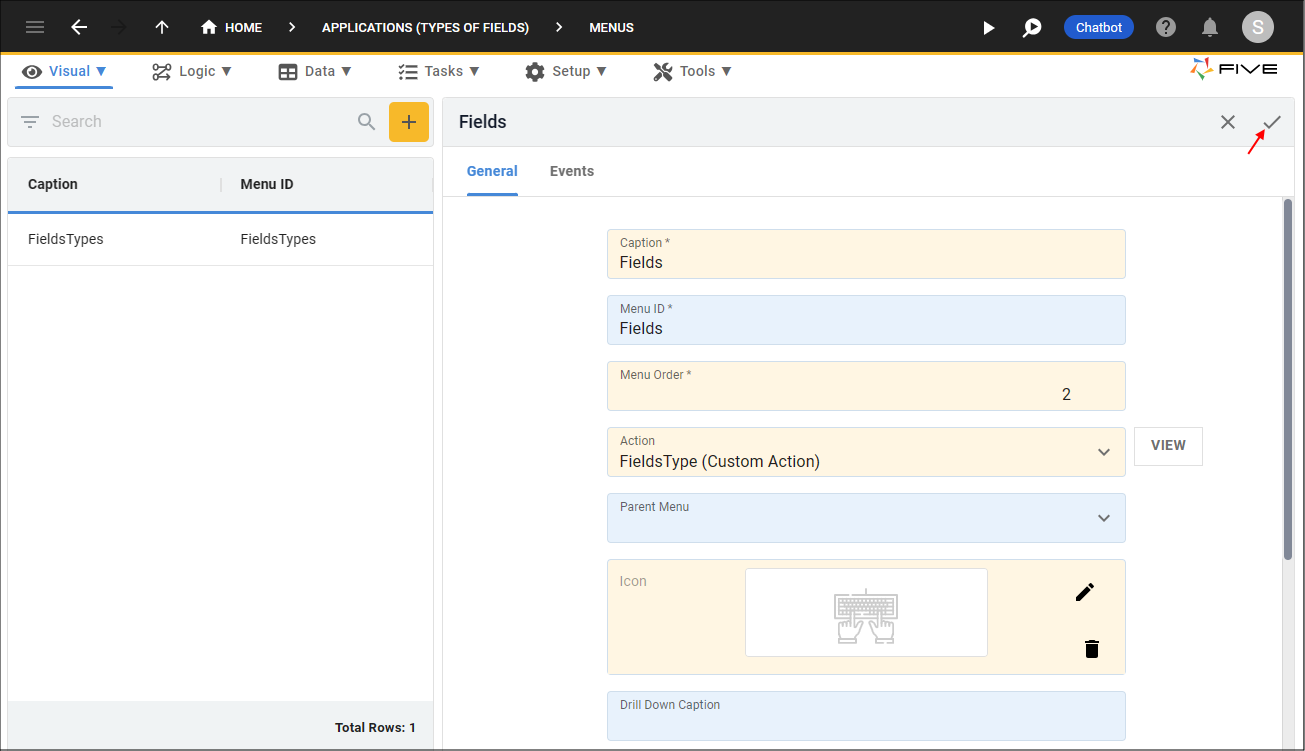
Figure 14 - Save the Menu record
Run Your Application
1. Click the Run button.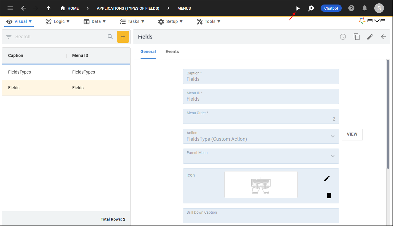
Figure 15 - Run button
2. Click the menu item holding the custom action.
info
Your custom form is now available and takes the entire screen.
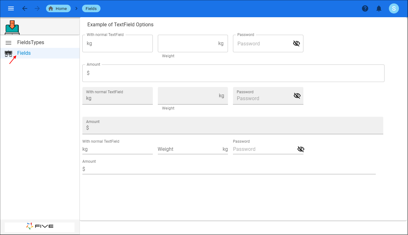
Figure 16 - Custom Action with Boston user interface
tip
If you would also like your custom action to have the screen space taken by the menu, set your User Interface to New York!
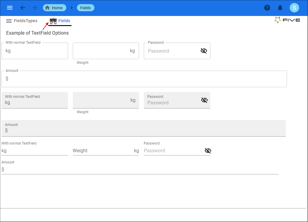
Figure 17 - Custom Action with New York user interface
Create an Action Button for a Custom Action
info
By creating an action button for your custom action, the custom action will take the space that a form normally takes. Creating a button to open your custom action
requires two steps:
- A function to be created using Five's inbuilt function, displayCustomForm()that takes the Custom Action's action ID as a parameter.
- Create an action button on a form.
Create the Function for the Action Button
1. Click Logic in the menu.2. Click Code Editor in the sub-menu.
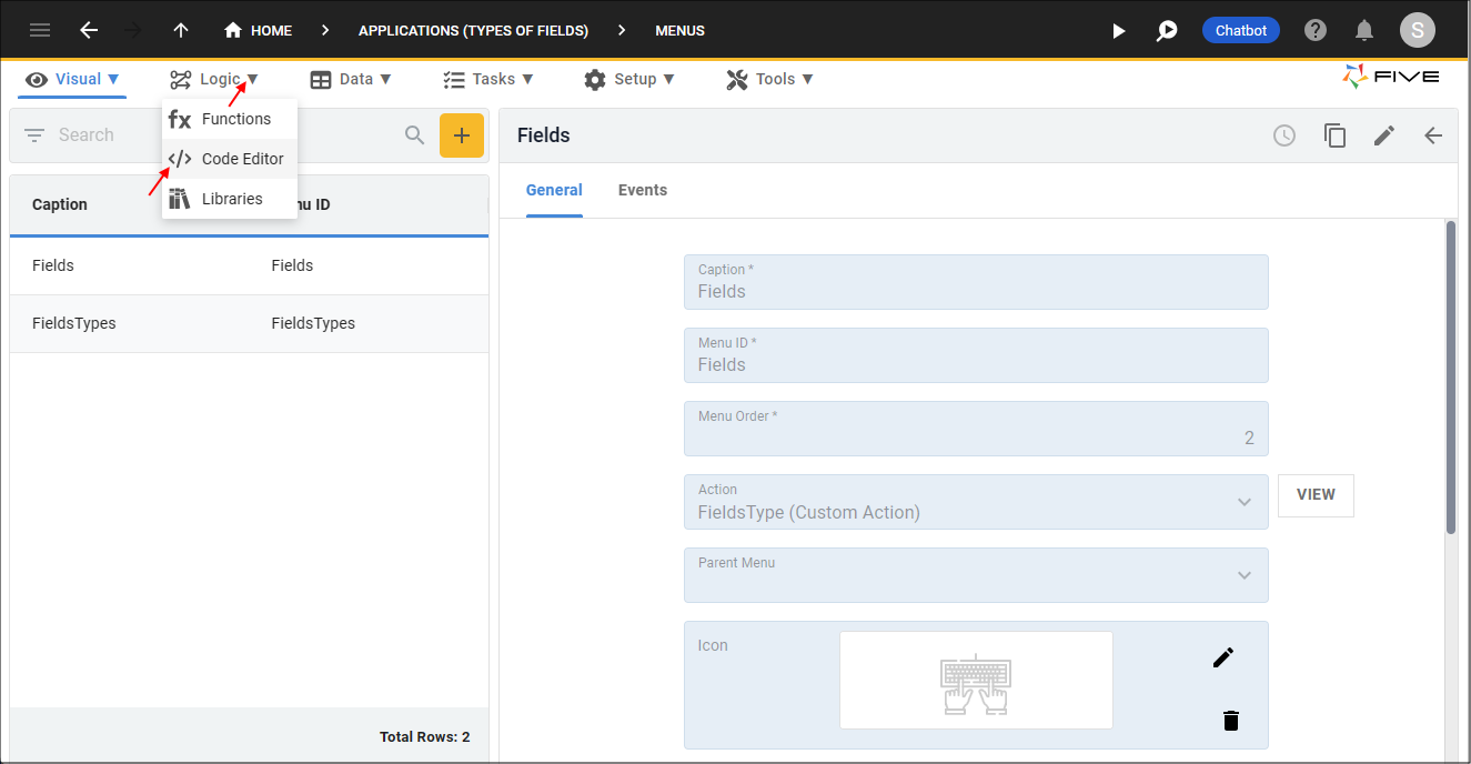
Figure 18 - Code Editor menu item
3. Click the Add New Code button.
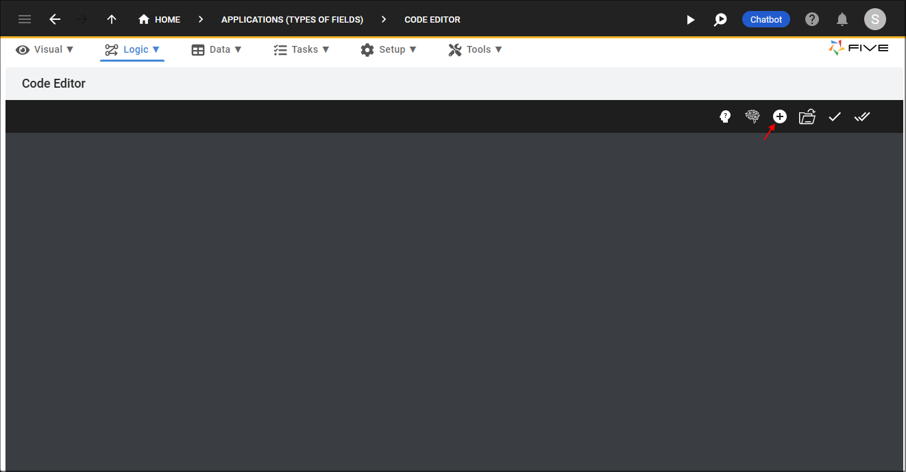
Figure 19 - Add New Code button
4. Type an ID in the Function ID field.
5. Click the OKAY button.
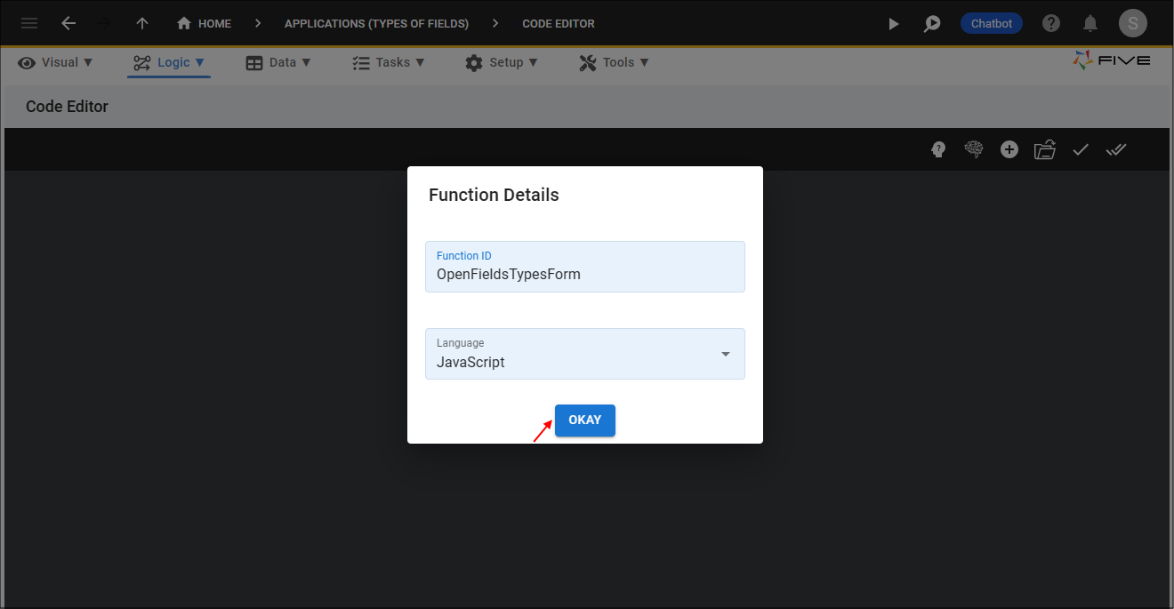
Figure 20 - Add a Function
6. Copy and paste the code line below in the Code Editor between lines 1 and 3.
caution
The
displayCustomForm()
takes a Custom Action's action ID as a parameter, ensure you have your custom action ID passed in.
displayCustomField()
five.displayCustomForm('FieldsType');
7. Click the Save Current Tab button.
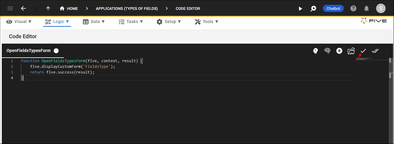
Figure 21 - Save the Function record
Create an Action Button
1. Click Visual in the menu.2. Click Forms in the sub-menu.
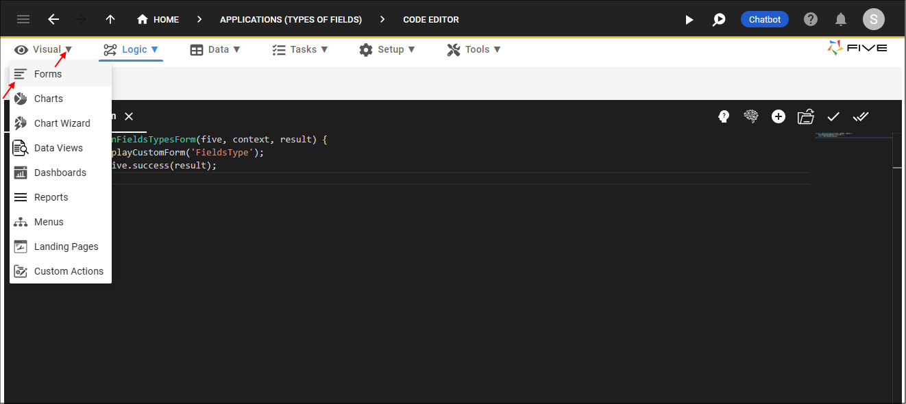
Figure 22 - Forms menu item
3. Select the form record in the list.
info
This is the record that is specified in the prerequisites.
4. Click the Action Buttons tab.
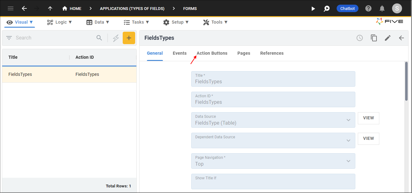
Figure 23 - Action Buttons tab
5. Click the Add Actions Button button.
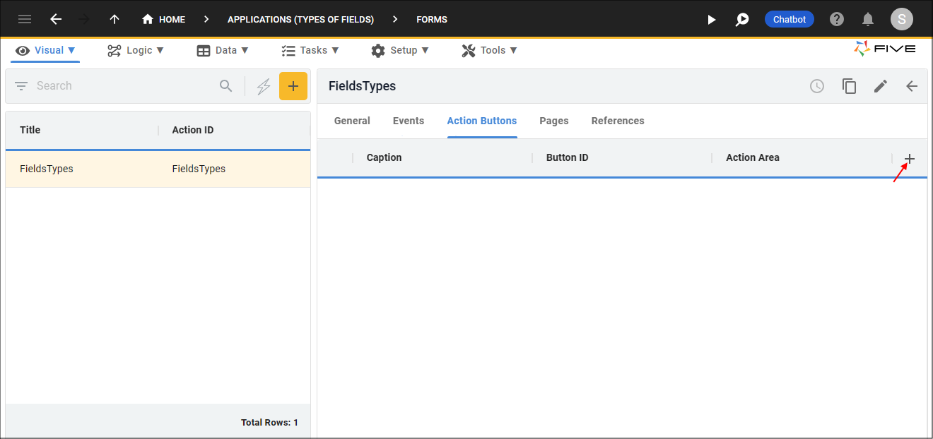
Figure 24 - Add Action Buttons button
6. Type a caption in the Caption field.
7. Click the lookup icon in the Action Area field and select List.
8. Click the edit button in the Icon field and open an image file.
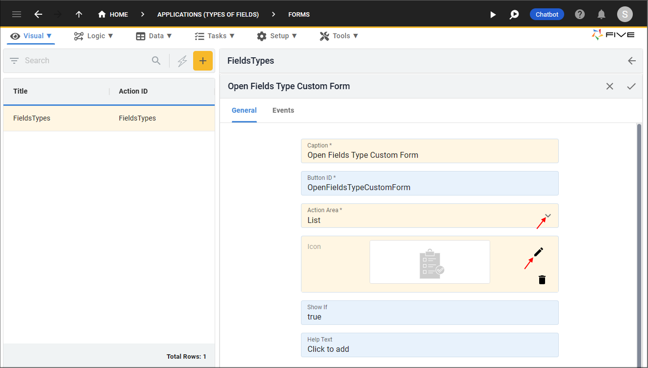
Figure 25 - Add an Action Button
9. Click the Events tab.
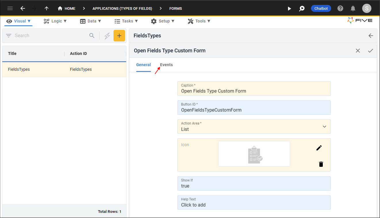
Figure 26 - Events tab
10. Click the lookup icon in the On Press field and select the function ID.
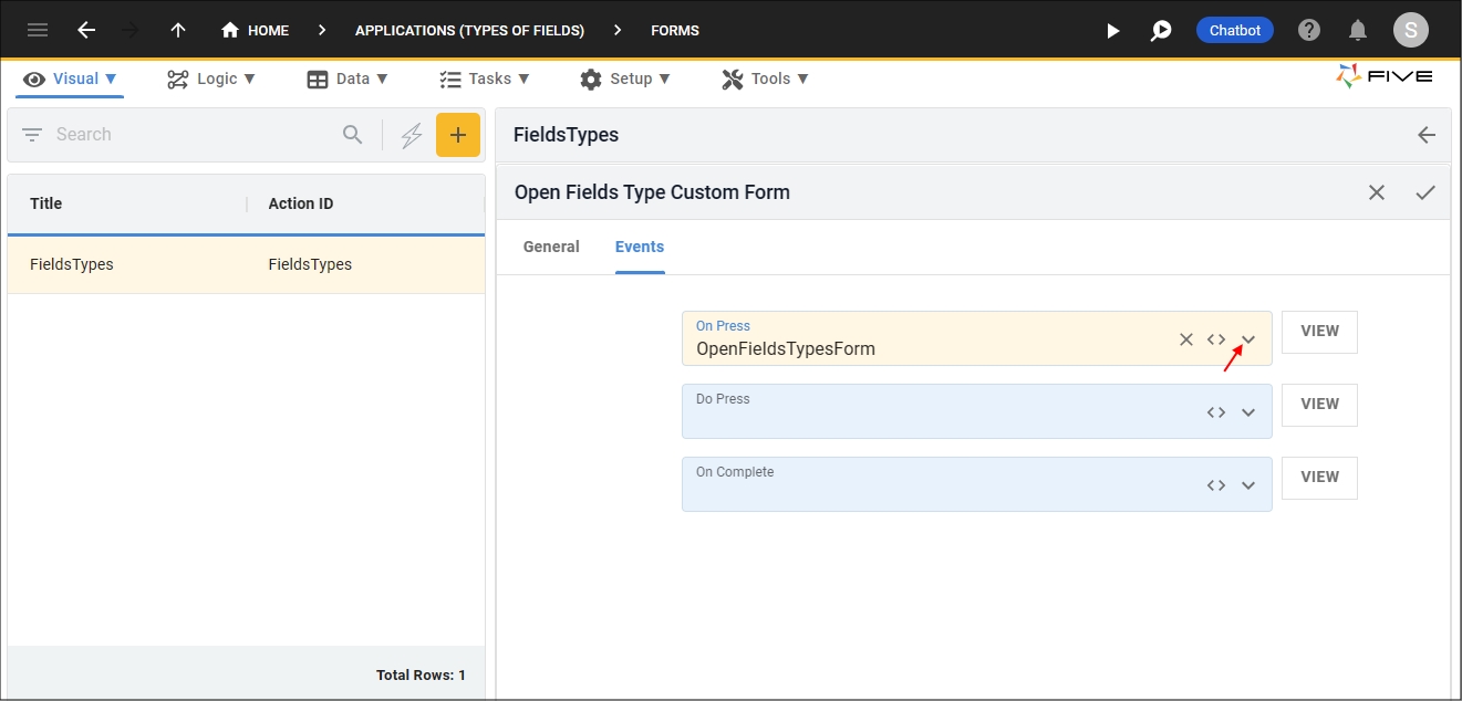
Figure 27 - Attach the function
11. Click the Save button in the form app bar.
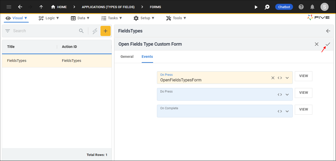
Figure 28 - Save the Event record
12. Click the Save button in the form app bar above the list.
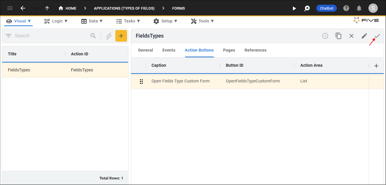
Figure 29 - Save the Form record
Run Your Application
1. Click the Run Button.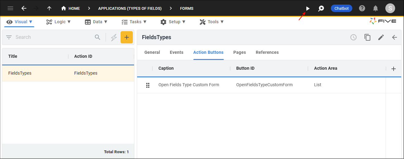
Figure 30 - Run button
2. Click the menu item holding the form.
3. Click your action button in the list app bar.
info
Your custom action will be loaded.
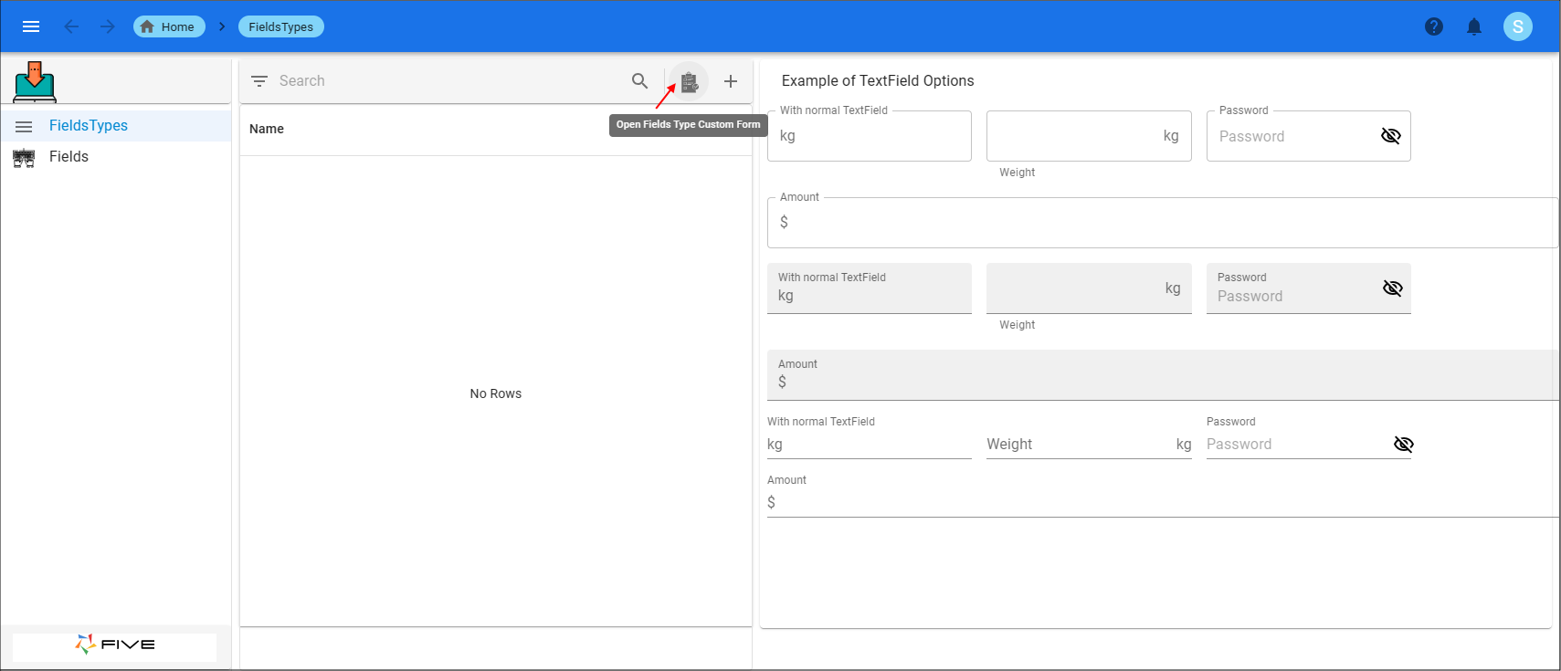
Figure 31 - Custom action - form
info
If you were to click the Add Item button, the form would be available rather than the custom action.
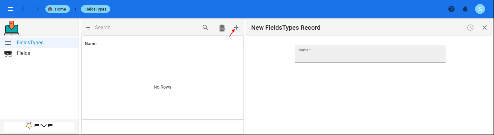
Figure 32 - Regular form