Add Custom Editors
Last updated 1/08/2023
Before you add a Custom Editor you will need to refer to the following chapters:- Project Setup, to know how to set up your development environment.
- Writing a Plugin, to know how to download Five's templates.
There are four steps to creating a custom editor:
- Write your code using Five's custom-editor-template.
- Run the final Webpack build command.
- Create a Custom Editor display type.
- Attach the display type to a field.
tip
You are not restricted to what can be coded in our custom-editor-template!
Use the custom-editor-template as a base for this example. The following example code and steps will assist you in how to write your own custom editor.
If you were to build and run the default template it would look like the image below. It is not in full screen mode and has an example checkbox component.
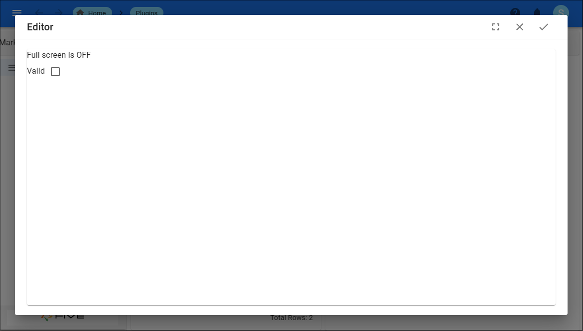
Figure 1 - Default editor
Add Your Code
1. Open your preferred IDE.2. Open the custom-template-folder.
3. Open the Src folder.
info
The customEditor.tsx file is the template you will use to write the code for your custom editor.
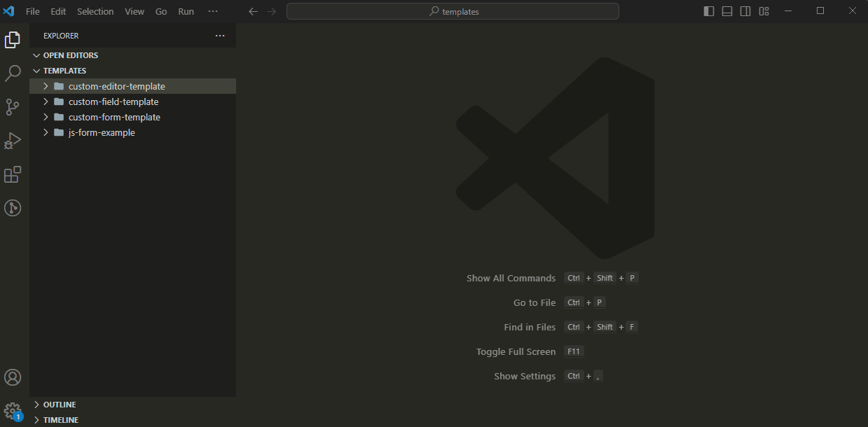
Figure 2 - customEditor.tsx file
info
The entire template can be edited to suit your code requirements. The example code that is used for this demonstration is provided below. The text editor being created will have a grid holding a text field and a Statistics button. When the button is clicked after typing in the text field, the number of words and sentences will be returned.
note
If you are want to use the code provided follow the steps below.
4. Delete the current code in the template.
5. Click the Copy button on the code block provided below.
6. Paste and save the code in your IDE.

customEditor.tsx
import React, { useImperativeHandle, useState, useEffect } from 'react';

import {
    Button,
    FiveInitialize,
    Grid,
    Paper,
    TextField,
    ThemeProvider,
} from './FivePluginApi';

import { CustomFieldProps } from '../../../common';

FiveInitialize();

const CustomEditor = React.forwardRef((props: CustomFieldProps, ref) => {

    // Use the ref to hook into Five's events
    // These can be removed if they are not required
    useImperativeHandle(ref, () => ({
        onOk,
        onCancel,
    }));

    // property values from five
    const { theme, five, onValueUpdated, value } = props;

    // state variables used in this editor
    const [ valid, setValid ] = useState<boolean>(value !== "");
    const [ rows, setRows ] = useState<number>(1);
    const [ stats, setStats ] = useState<string>('');

    // get handle to text editor control
    // we will use this to calculate the number of rows to display to fill the screen
    const control = document.querySelector('#TextEditorControl');

    const onOk = (closeDialog: () => void): void => {
        console.log("Save button clicked");

        // Do validation before saving and closing
        if(valid) {
            onValueUpdated(value);
            closeDialog();
        } else {
            five.message("Please make sure this is valid before saving!");
        }
    }

    const onCancel = (closeDialog: () => void): void => {
        closeDialog();
    }

    const onChange = (event: React.ChangeEvent<HTMLInputElement>): void => {
        onValueUpdated(event.target.value);
        setValid(true);
    }

    useEffect(() => {
        // calculate number of rows to display after initial rendering
        let newRows = (document.querySelector('#TextEditorControl').clientHeight / document.querySelector('#TextFieldControl').clientHeight) - 5;
        setRows(newRows);
    }, [control]);

    // when the user presses the button, this event will be called to do the calculation
    const onStatistics = (): void => {
        let text = document.querySelector('#TextFieldControl').textContent;
        let matches = text.match(/(\w+)/g);
        let wordCount = 0;
        if (matches !== null) {
            wordCount = matches.length;
        }

        matches =text.match(/\w[.?!](\s|$)/g);
        let sentenceCount = 0;
        if (matches !== null) {
            sentenceCount = matches.length;
        }

        setStats(`Word count : ${wordCount}, Sentence Count ${sentenceCount}`);
    }

    // render our custom editor to the screen
    return (
        <ThemeProvider theme={theme}>
            <Paper id='TextEditorControl' style={{ width: "100%", height: "100%" }}>
                <Grid container spacing={2}>
                    <Grid item xs={10}>
                        <TextField
                            fullWidth
                            id="TextFieldControl"
                            variant="outlined"
                            multiline
                            onChange={onChange}
                            value={value}
                            rows={rows}
                        />
                    </Grid>
                    <Grid item xs={2}>
                        <Button variant="outlined" onClick={onStatistics}>Statistic</Button>
                        <div>{stats}</div>
                    </Grid>
                </Grid>
            </Paper>
        </ThemeProvider>
    );
});

export default CustomEditor;
tip
React Hooks can be imported, useEffect is used below.
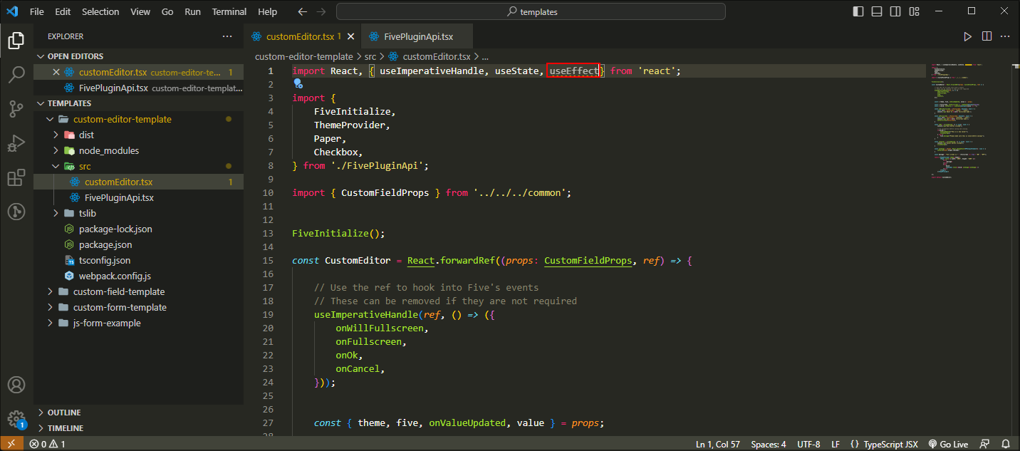
Figure 3 - useEffect React Hook
tip
Supported components can be imported.
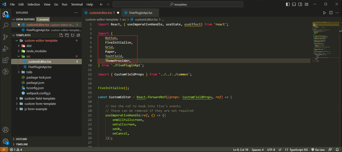
Figure 4 - Import supported components
tip
Five's events enable you to hook into the editor's default buttons, if they are not required you can remove them.
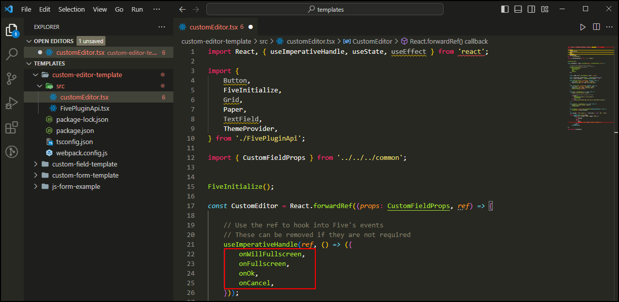
Figure 5 - Five's events
Run Your Final Webpack Build Command
1. Open a new terminal.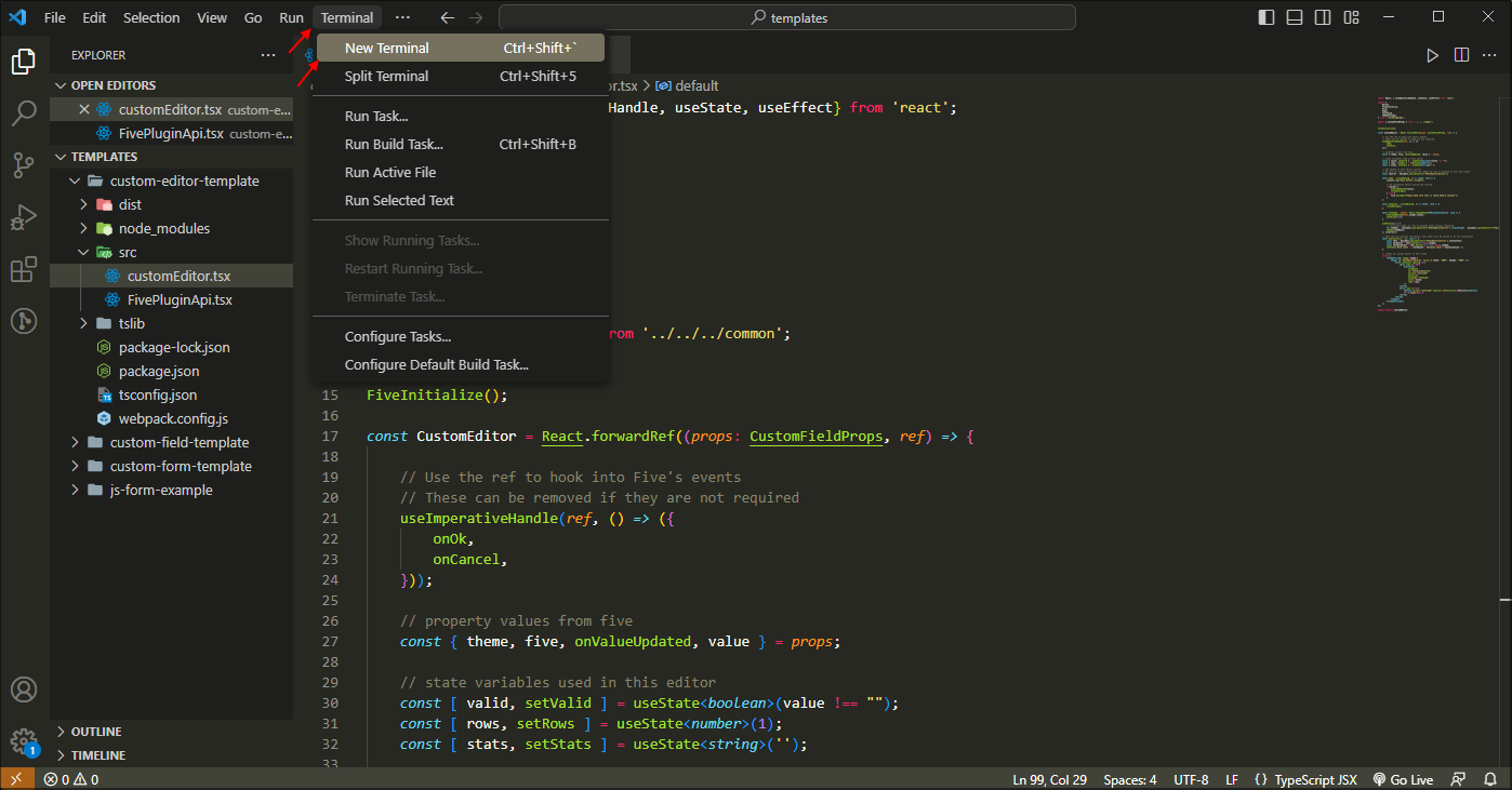
Figure 6 - Open a new terminal
2. Cd into the custom-editor-template and run the Webpack command to build your final build.
node ./node_modules/webpack/bin/webpack.js
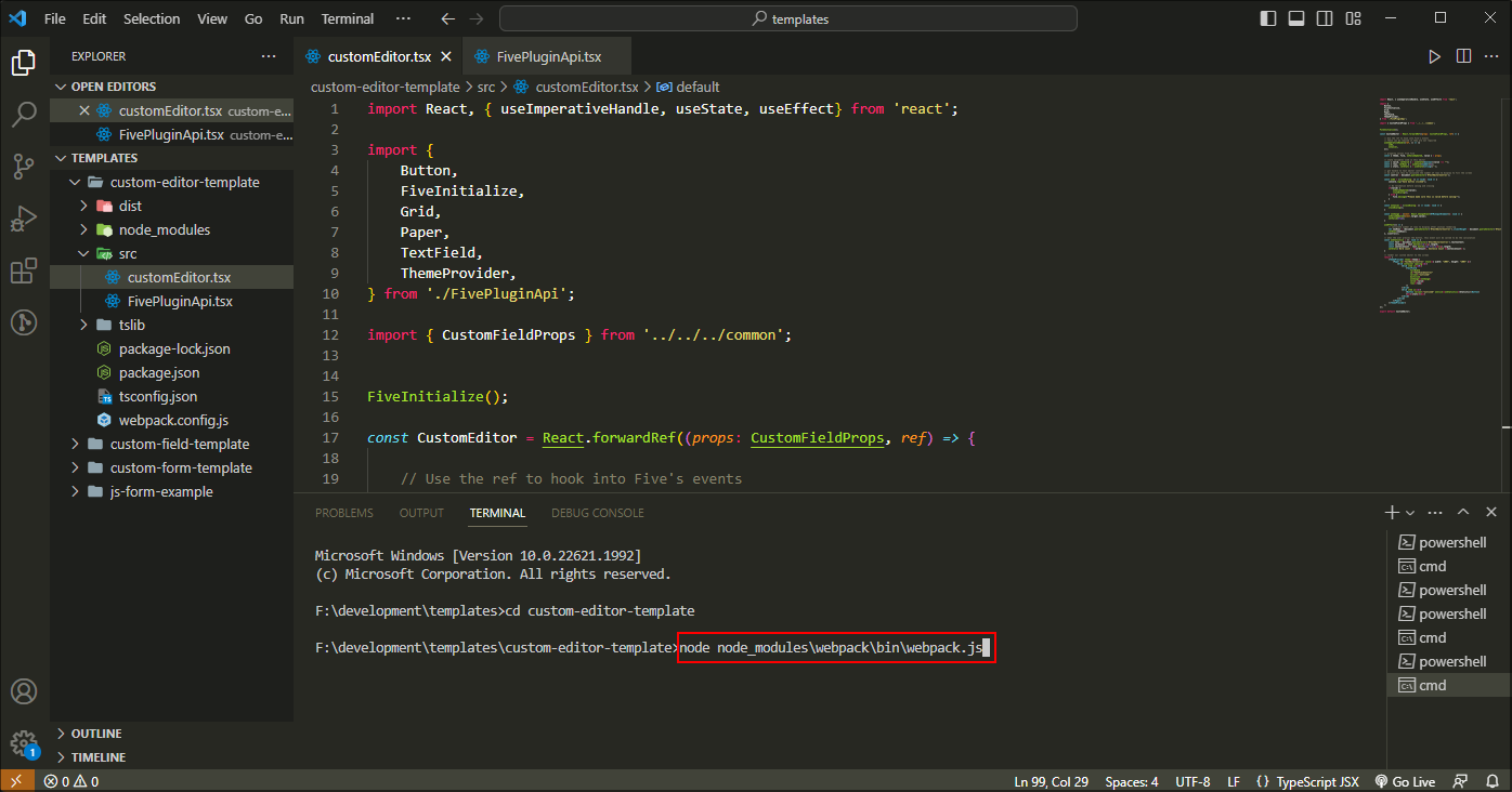
Figure 7 - Run the Webpack command
3. Locate and open your dist folder.
4. Inside the dist folder compress your .js plugin file to a zip file.
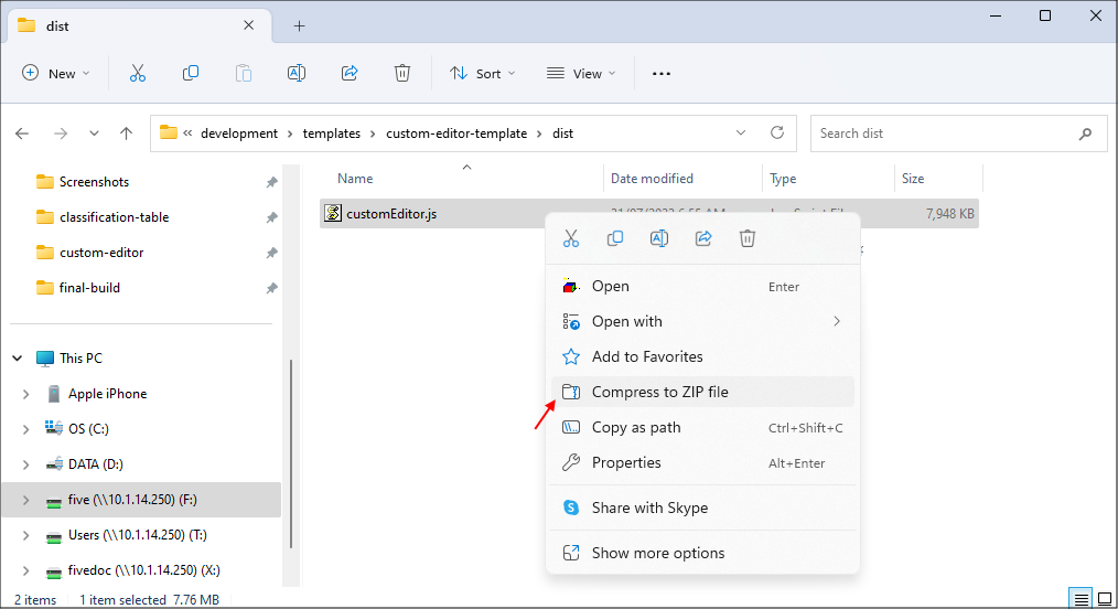
Figure 8 - Compress your .js plugin file to a zip file
Recommended
Rename your zip file to a more relevant name.
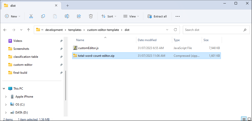
Figure 9 - Rename your zip file
Prerequisites
After running your final Webpack build command and compressing your .js plugin file, you will need to return to Five and create a custom display type to attach to your field.For the WordCount custom editor example, an application was created with one table called Data that has one field called WordCountEditor.
Data Table
| Field | Data Type | Size |
|---|---|---|
| WordCountEditor | Text | 4096000 |
Navigate to Display Types
1. Click Setup in the menu.2. Click Display Types in the sub-menu.
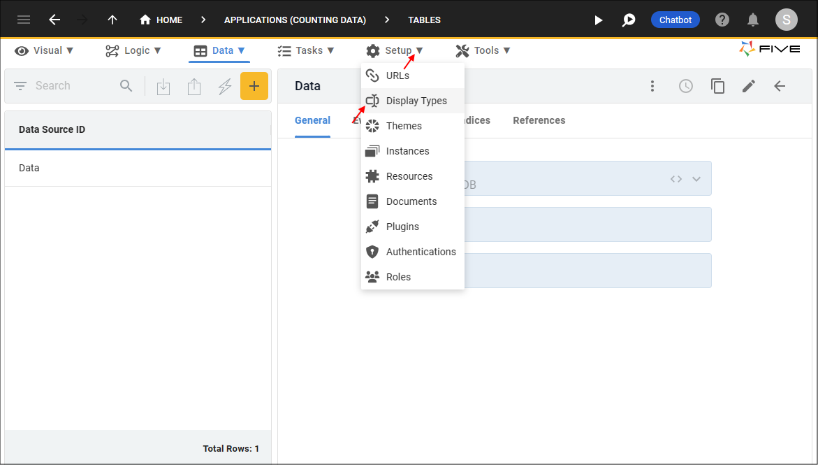
Figure 10 - Display Types menu item
Add a Custom Editor
1. Click the Add Item button.2. Type a name in the name field.
3. Click the lookup icon in the Display Type field and select Custom Editor.

Figure 11 - Add a Custom Editor display type
4. Click the UPLOAD PLUGIN button in the Upload Plugin field.
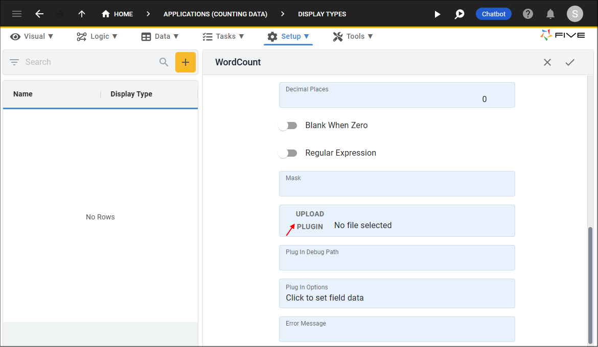
Figure 12 - UPLOAD PLUGIN button
5. Navigate your files and open the zip folder.
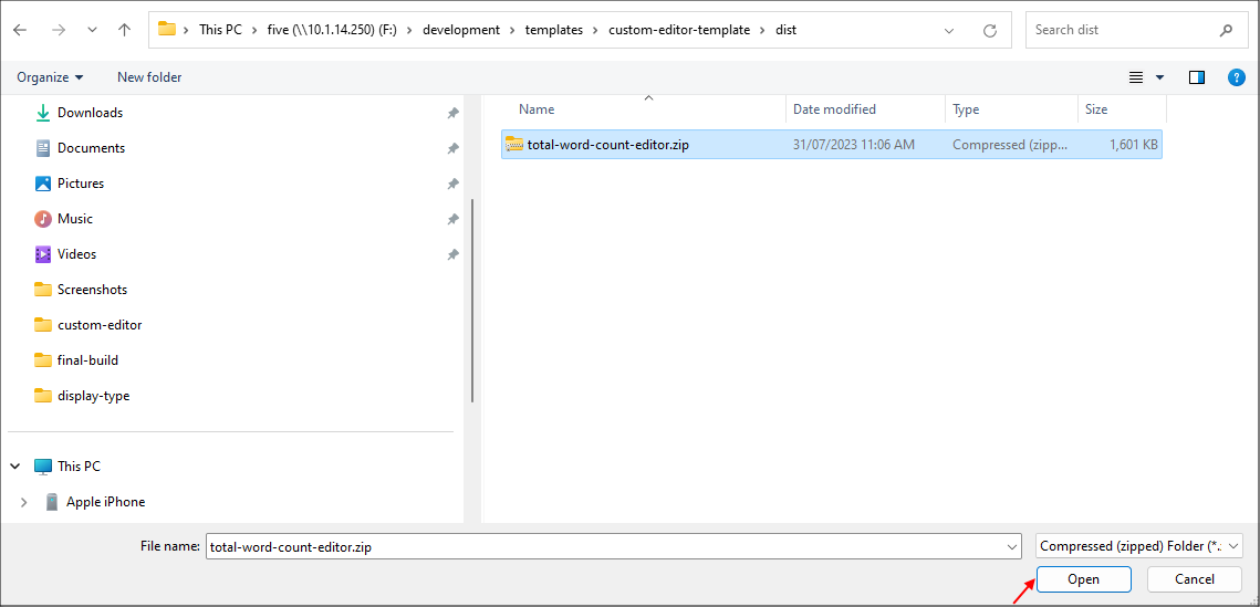
Figure 13 - Zip file
6. Click the Save button in the form app bar.
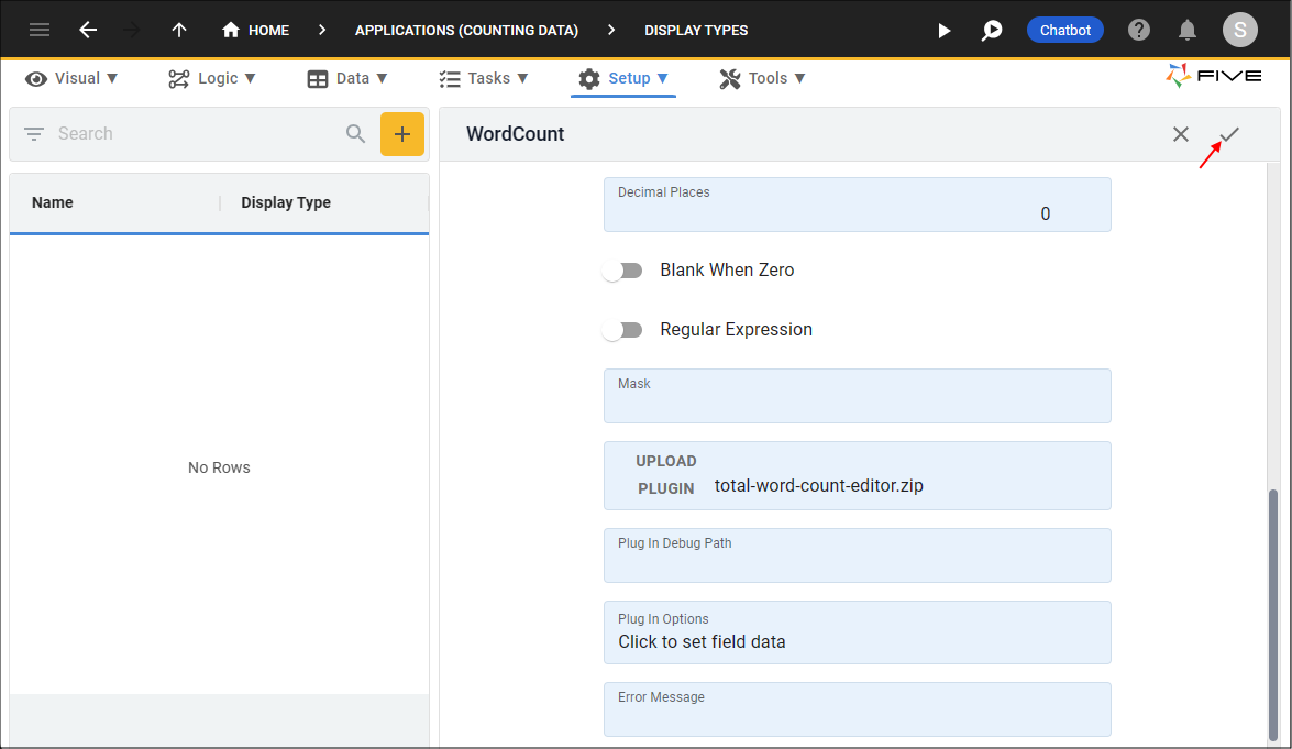
Figure 14 - Save the Custom Editor display type
Attach the Custom Editor
info
The Custom Editor display type can now be attached to a field. For this example, the custom editor is added to a form field.
1. Click Visual in the menu.
2. Click Forms in the sub-menu.
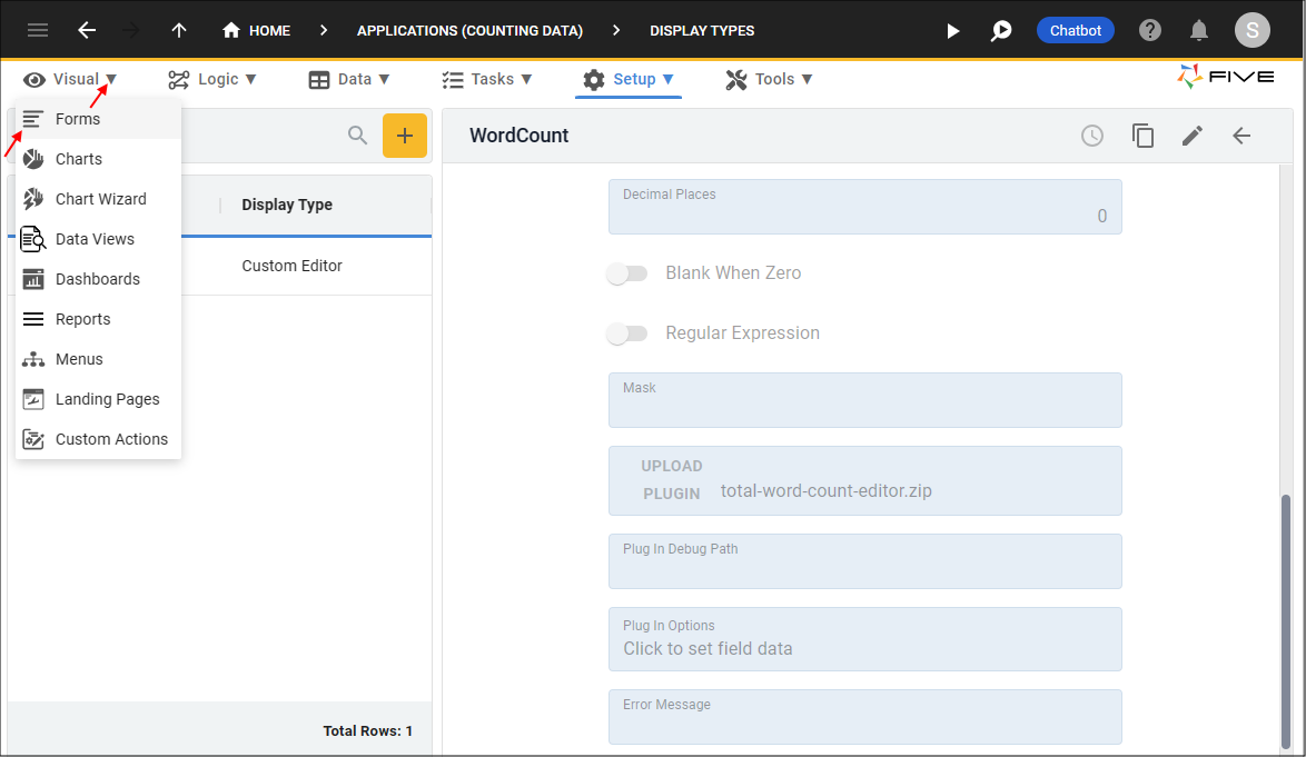
Figure 15 - Forms menu item
3. Click the New Form Wizard button.
4. Click the lookup icon in the Main Data Source field and select a data source holding the field. For this example, a table is selected.
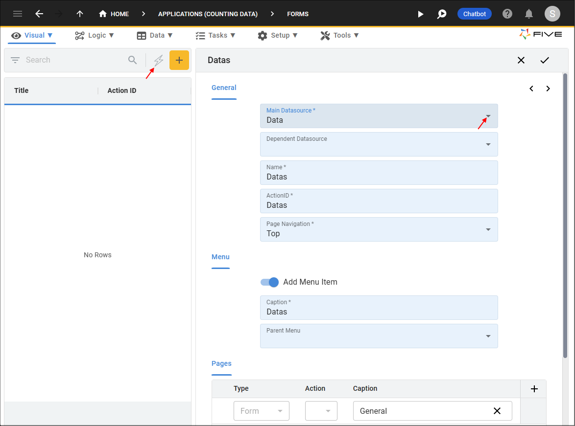
Figure 16 - Add a form
5. Click the Next button.
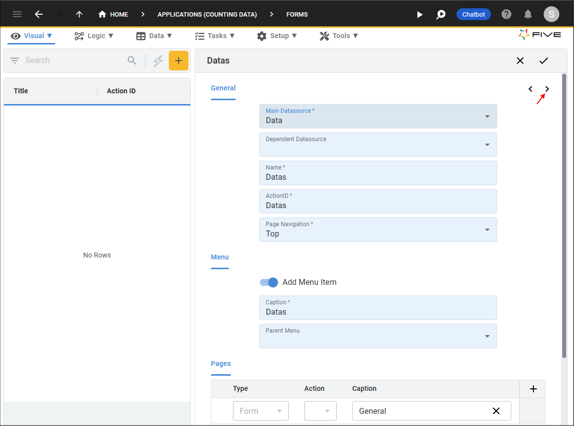
Figure 17 - Next button
6. Click the lookup icon in the Display Type field for the required field and select the name of your display type.
tip
Your custom display types will be at the top of the lookup list!
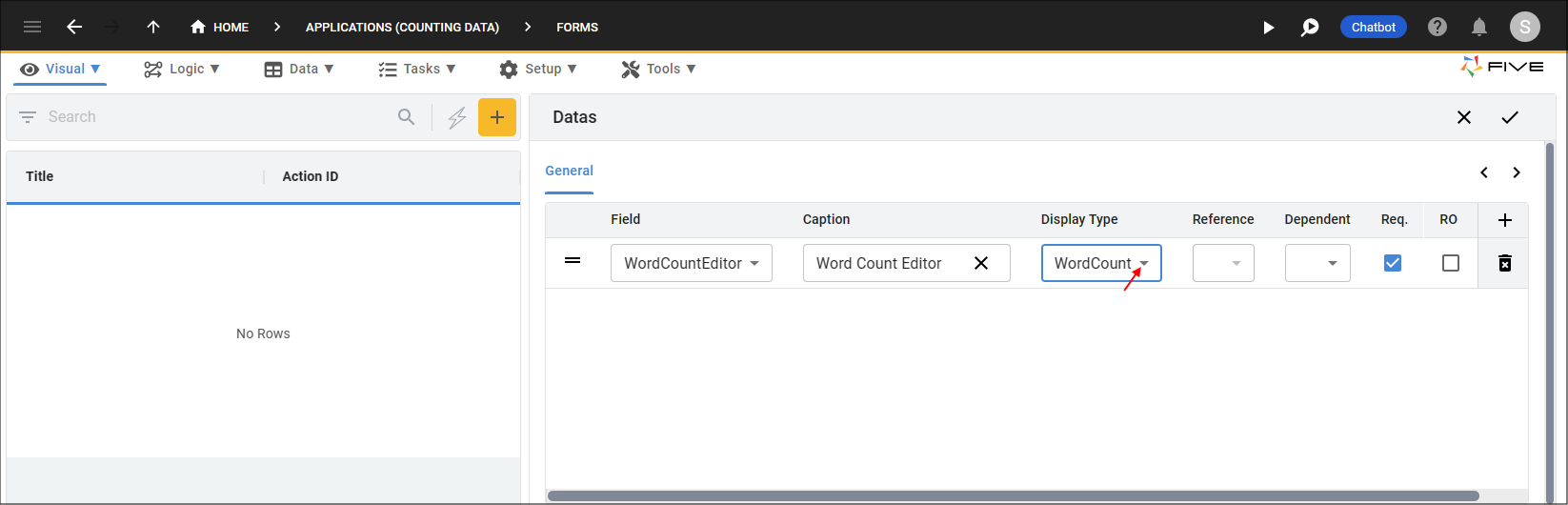
Figure 18 - Select the Custom Editor display type
7. Click the Save button in the Form Wizard app bar.

Figure 19 - Save the form
tip
If your form is already saved, just edit your form record, navigate to the field and edit the Display Type field!
caution
At any time in the future if you update your plugin code, you will need to compress the dist folder again and upload the updated zip file into Five.
Run Your Application
1. Click the Run button.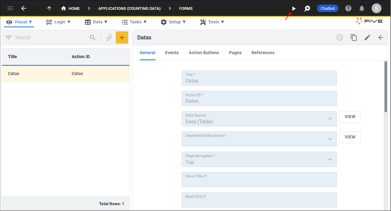
Figure 20 - Run button
2. Click the Add Item button.
3. Click the lookup icon in the custom editor.
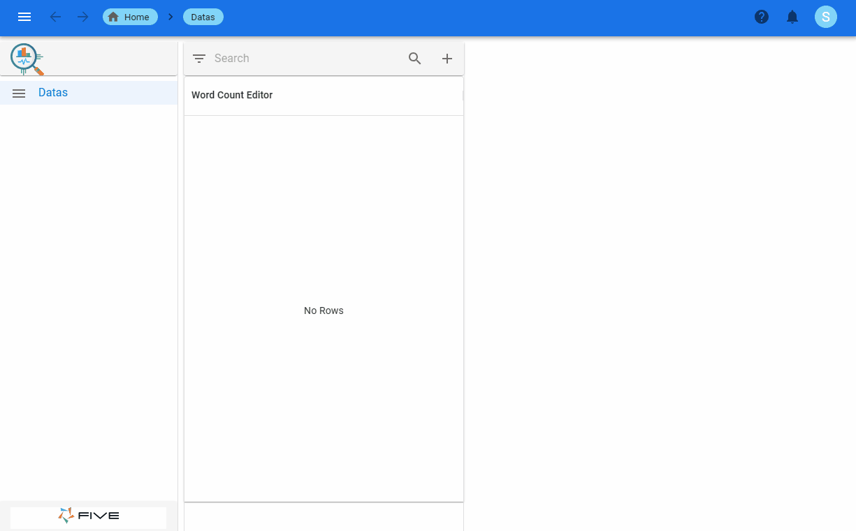
Figure 21 - WordCount custom editor