User Interface Types
Last updated 24/02/2026
User Interfaces for Your Application
Five provides several distinct user interface layouts designed to support different working styles and screen preferences. Each interface presents the same application functionality, but organises navigation and content differently.
Boston
The Boston user interface is best for structured, data-heavy applications and users who prefer constant visibility of navigation and forms.
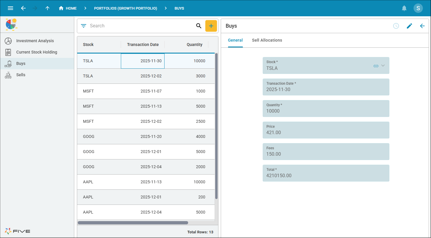
Layout Structure
- Left: Main navigation menu
- Middle: Record list
- Right: Record form
The Boston interface keeps everything visible at once:
- You can navigate between modules using the left-hand menu
- The record list displays available entries
- Selecting a record loads its details into the form panel, which remains visible
- Efficient multi-tasking
- Easy switching between records
- Familiar three-panel business layout
- Ideal for desktop users with wider screens
New York
The New York interface is the default interface for the applications you build in Five. It is best for users who prefer more horizontal screen space for data and forms. It is designed to maximize usable screen space while maintaining structured clarity. Unlike side-navigation layouts, New York positions the primary navigation across the top of the screen, allowing the main workspace to focus on data, records, and forms.
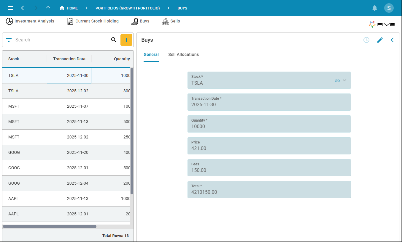
Layout Structure
- Top: Main navigation menu moves to the top of the screen
- Main Area: Combined list and form
In the New York interface:
- The navigation menu moves to the top of the screen
- The main workspace expands, giving more room to display both the record list and form
- More space for forms and detailed data
- Cleaner, modern layout
- Better use of wide screens
- Improved readability for complex forms
Seattle
The Seattle user interface is best for focused, task-orientated workflows and improved navigation clarity. This interface is optimized for deep focus and task completion rather than multitasking across multiple panels. It is designed to remove competing visual elements and allow users to concentrate fully on the record or task at hand.
Instead of constantly displaying navigation, lists, and forms simultaneously, the interface prioritizes one primary activity at a time. When a user selects a record, the workspace transitions into a full-view form layout, temporarily replacing the list. This creates a more immersive, distraction-free experience.
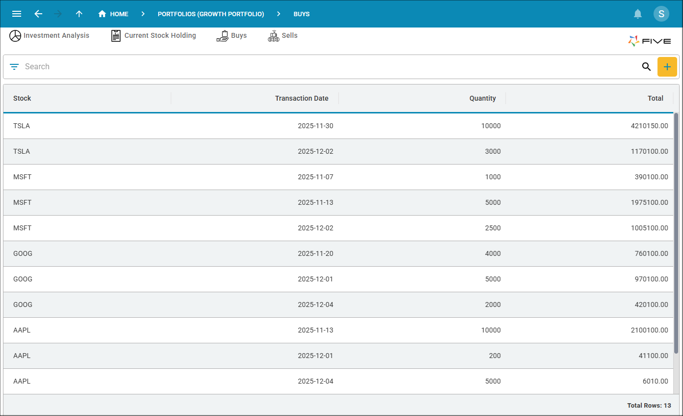
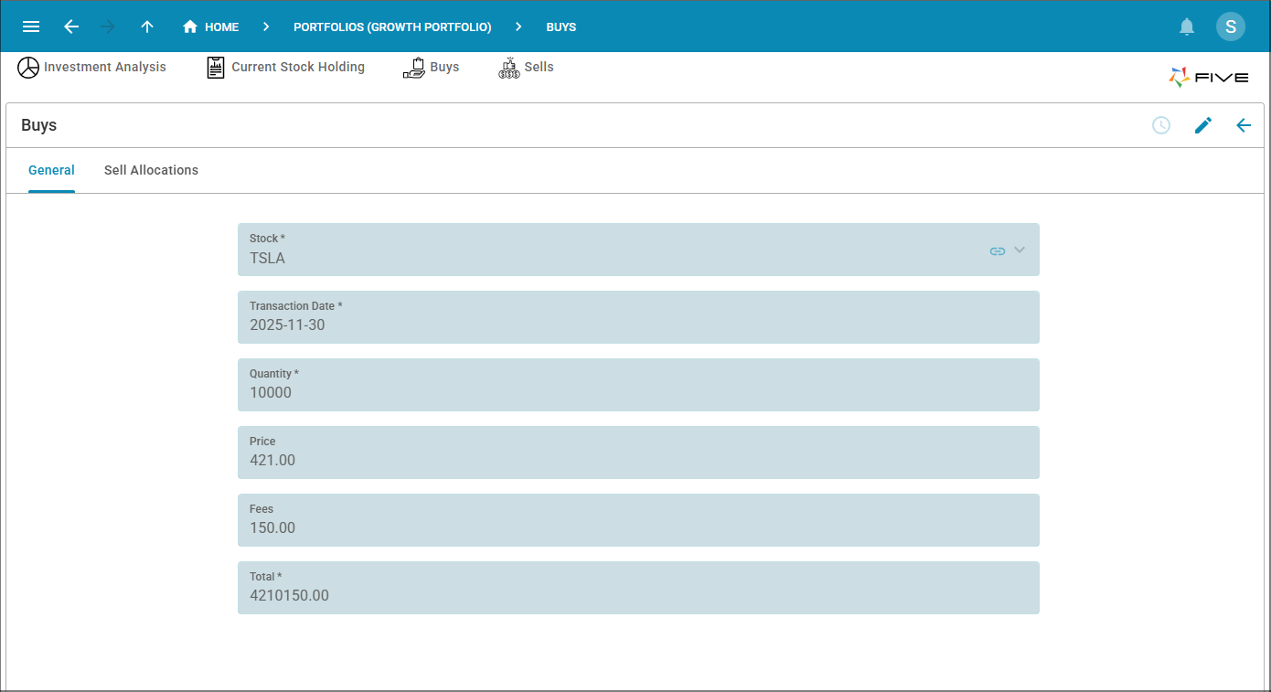
Layout Structure
- Default View: Full-screen record list
- When Record Selected: Full-screen form replaces the list
Seattle user interface is designed to improve focus:
- By default, the record list occupies the entire screen
- When you select a record, the form opens in full view, replacing the list
- A Back button returns you to the full record list
- Distraction-free record editing
- Clear navigation between list and form
- Simplified workflow
- Excellent for smaller screens and tablet use
Choosing the Right Interface
| Interface | Best For | Navigation Style |
|---|---|---|
| Boston | Data management and power uses | Left sidebar |
| New York | Wide screens and detailed forms | Top menu |
| Seattle | Focused record editing | List to full form |
Summary
All three interfaces provide the same functionality, they simply organize the screen differently:
- Boston - Traditional three-panel layout
- New York - Top navigation with expanded workspace
- Seattle - Focus-first, full screen workflow
Your organization can choose the interface that best suits how you want your users to work in your application.