Introduction
Last updated 18/03/2026
Overview
In Five, display types control how field data is presented, formatted, and validated within your application. They act as a layer on top of a field's underlying data type, allowing you to standardize how data is displayed and entered across forms and data views, etc.
Five includes a number of built-in display types which follow a naming convention using a leading underscore
In addition to the built-in options, you can create your own custom display types through the Display Types view. This allows you to tailor how data behaves and appears based on your specific requirements.
Creating Custom Display Types
Custom display types are defined by one of Five's display types, for example, _Number, _Date, _Text, etc. Once created, they can be reused across multiple fields, ensuring consistency throughout your application.
When configuring a display type, you can define:
Formatting Rules (Masks)Masks control how data is visually structured. For example, you might enforce formatting for phone numbers, post codes, or identification numbers.
Validation Rules (Regular Expressions)Regular expressions (regex) allow you to validate user input by enforcing specific patterns, ensuring that only correctly formatted data is accepted.
Display Input TypeFor fields used on mobile devices, the Display Input Type determines which keyboard layout is available when users enter data.
Field DataSome display types support pre-defined field data, which can be used to populate selectable values or define formatting rules.
Navigate to the Display Types View
Select Setup in the menu followed by Display Types in the sub-menu.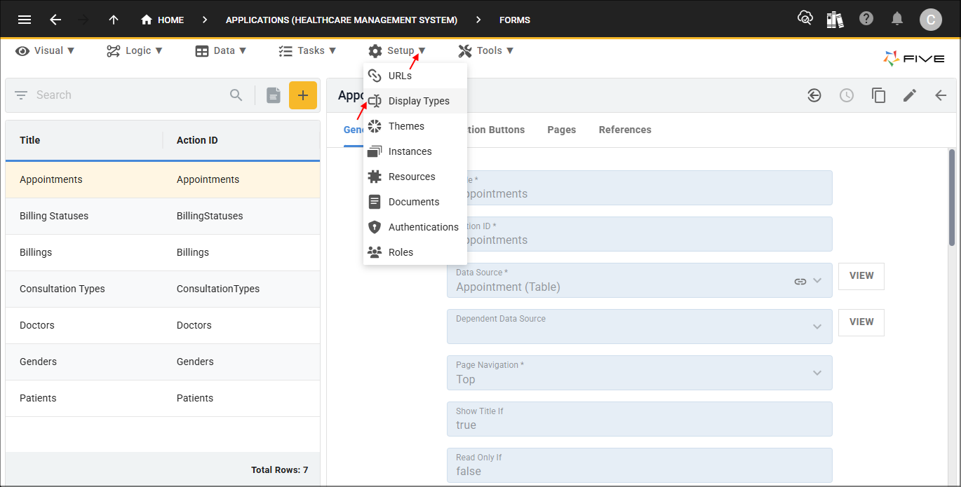
Understanding the Display Types Form
Fields on the Display Type form can be used to configure a display type to:
- Control how data is displayed and formatted
- Validate input using masks and regular expressions
- Define selectable options or formatting rules through field data
- Specify which keyboard is shown on mobile devices
- Enforce numeric, text, or other constraints like minimum/maximum lengths or values
Display Type Fields
The following table provides a brief overview of each of the fields on the Display Type form.
| Field | Description |
|---|---|
| Name | Enter a name for your display type |
| Display Type | Select an existing Five display type to use as the base for your custom display type |
| Display Input Type | Defines the keyboard shown on mobile devices when entering data |
| Minimum Lines | Sets the minimum number of visible lines for the field |
| Maximum Lines | Works with Minimum Lines to allow the field to expand dynamically up to this number of lines as needed |
| Justification | Controls text alignment within the field, default is left |
| Minimum Length | Specifies the minimum number of characters allowed |
| Maximum Length | Specifies the maximum number of characters allowed |
| Pad Character | Adds padding to the field value up to the Maximum Length, for example, using 0 will pad the value with zeros based on the selected justification |
| Minimum Value | Sets the minimum numeric value allowed (integer or float) |
| Maximum Value | Sets the maximum numeric value allowed (integer or float) |
| Decimal Places | Defines the number of decimal places displayed for numeric values |
| Blank When Zero | When enabled, hides 0 values for integer or float fields if no value is present |
| Regular Expression | Enables regex validation, when enabled the Mask field is treated as a regular expression |
| Mask | Defines the input format, can be a standard mask or a regular expression (if Regular Expression is enabled) |
| Field Data | Defines key: value pairs or formatting rules for the field |
| Error Message | Custom message displayed when user input fails validation |