Add a Chart
Last updated 8/08/2025
Add a Chart with Five's Chart Wizard
Learn how to add a chart with Five's Chart Wizard. It is highly recommended that you read the Introduction chapter on Five's Chart Wizard before creating your first chart. This will explain how to access the Chart Wizard and the record once it has been saved.
Add a Chart and Select Your Data Source
A data source can be a saved table or query in Five, or an external connection that you have established in Five. The data you want to visually display in your chart must be in your data source. When you select a data source you will see the results returned.
1. Give your chart a title and select your data source.
Select the Fields From your Data Source
The fields you select in the X Value Column and Y Value Column fields will be the dataset for the chart area. When you select your fields, you will see the results and the chart preview change reflective to your selected fields.
2. Select your fields from your data source in the X Value Column and the Y Value Column fields.
Define Your Chart Area
While in the Chart Wizard, you can only create one chart area, however, a chart can have multiple chart areas hence why an ID and a title need to be added. By default, the chart title does not show in your chart, to show the title, you will need to use the Show Chart Area Title switch. If you want to add multiple chart areas to your chart, you will need to edit the record in the Charts view and go to the Areas page.
3. Give your chart area an ID and a title.4. Optional: If you want to show the area title, click the Show Chart Area Title switch.

Select the Chart Type
Switch between the chart types and you will see how each one represents your data in the chart preview.
5. Select your preferred chart type.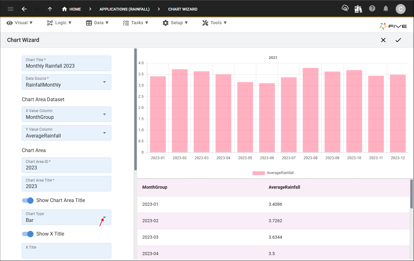
Define a Menu Item for Your Chart
Creating a menu is optional as you may want your chart on a form page, or in a report, or on a dashboard. If you want to add a menu item for your report, you will need to use the Add Menu Item switch. The caption is defaulted to the same as your chart title, once you turn the Add Menu Item switch to true, the caption can be edited. A parent menu can be added for your chart.
6. Optional: If you require a menu item for your chart, click the Add Menu Item switch.
Name Your Legend and Choose Your Colors
Looking at the chart, you can see the legend label uses the value in the Y Column Value field, this can be edited in the Legend Label field.
7. Give your legend a label.
The Color Picker is used to choose the color for your chart. When creating a pie or doughnut chart, if you want the different segments to be different colors, you will need to select several colors. When either of these charts are selected the Add New Color button will become available in the Colour Picker and you can add as many colors that you need. Colors can be selected by:
- Clicking a color block
- Using the slider and clicking in the colour window
- Adding Hex values
- Adding RGB values

Save Your Chart
9. Click the Save button in the Chart Wizard app bar.